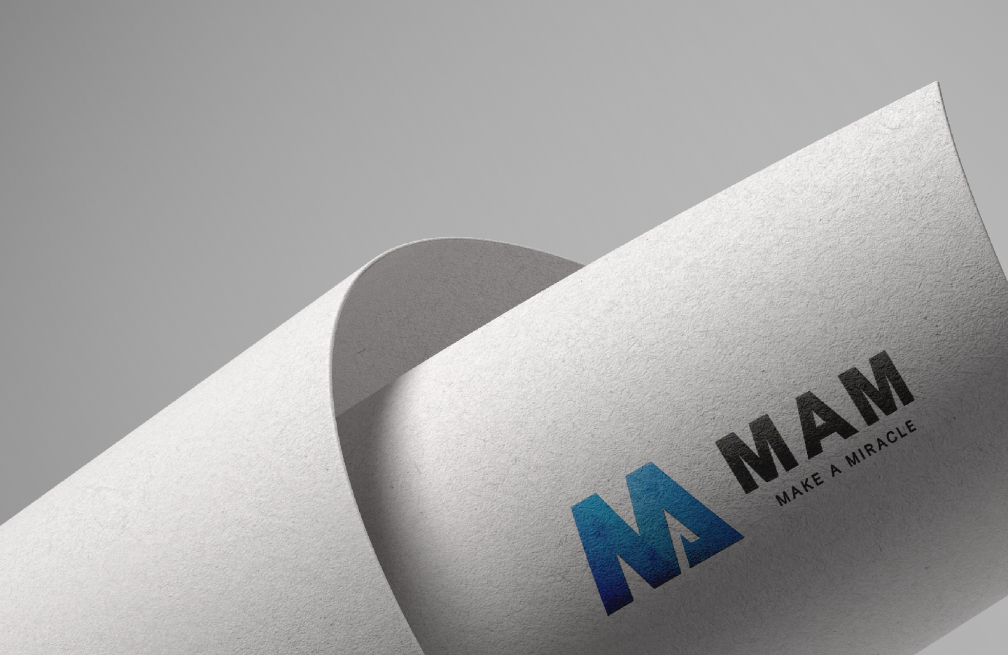
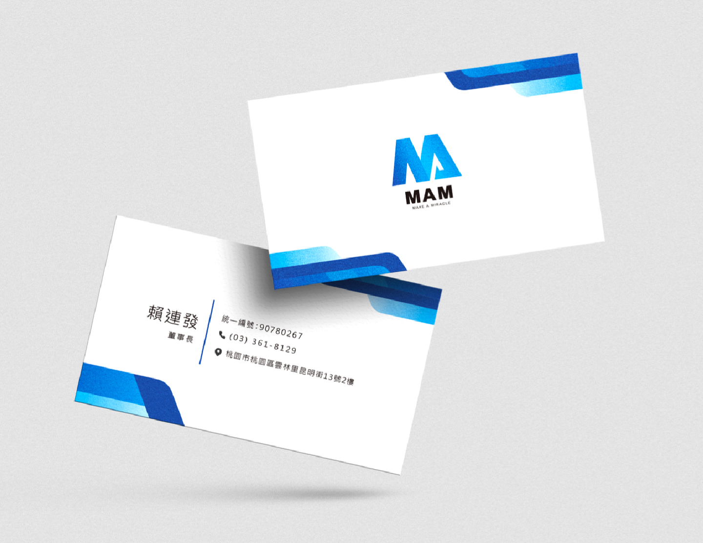
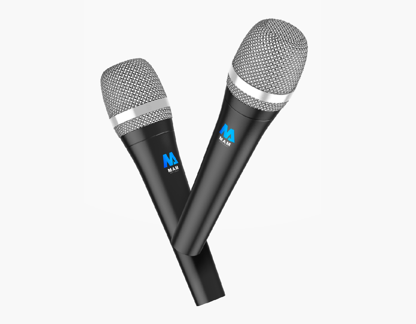
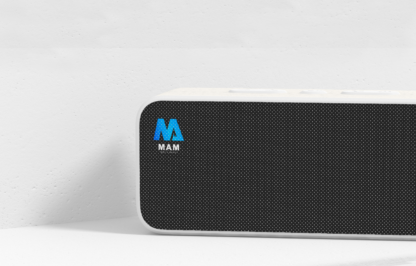
The brand name "MAM" is derived from the initials of the English phrase "MAKE A MIRACLE", simplified to "MAM". The design uses a black font as the basis, with the letters M and A merged into the image, allowing consumers to understand the brand name at a glance. An upward arrow element is added to the letter A, expressing the company's vision of continuous upward development. The design uses a gradient of ocean blue colors, alternating to create a lively and youthful image, reducing the distance between consumers and making the brand more approachable.