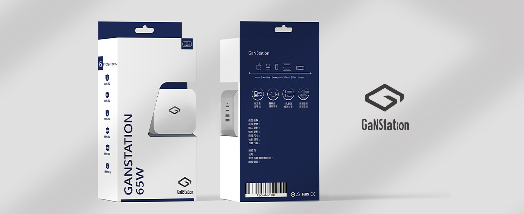
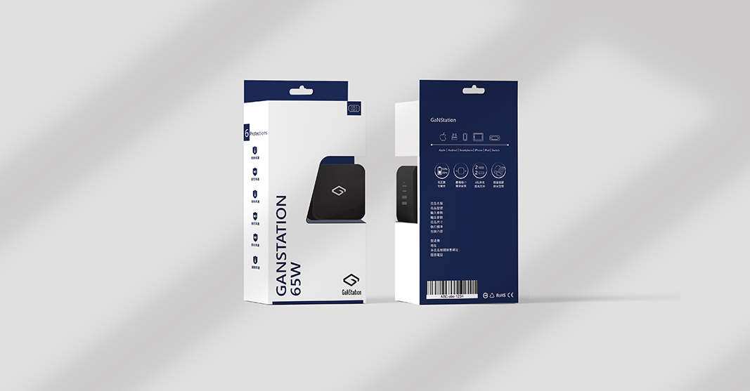
In the product design using similar and contrasting colors to the Jinhao logo as the main color scheme, a concise and powerful brand image is created, giving consumers a comfortable visual experience. By using similar and contrasting colors as the main color scheme and adopting a simple style and functional icon design elements, consumers can easily recognize and use the product. It is hoped that such a design can bring a better experience for the brand, while also increasing consumer awareness and trust in the brand.