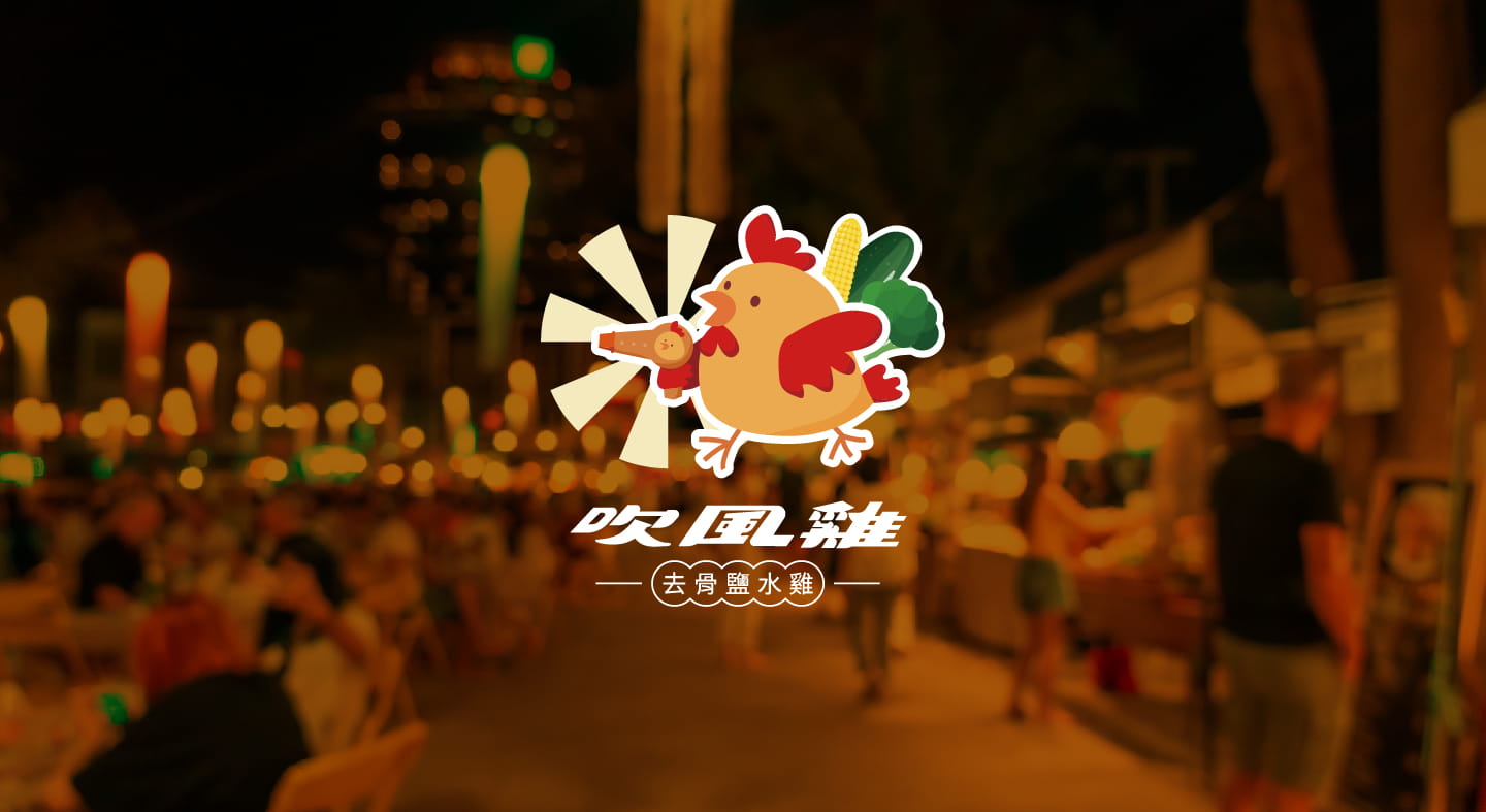
Due to the client's booth being located in Hsinchu, the brand logo was integrated with the local unique feature of "wind" imagery, combined with the client's preference for Q-version chickens and the brand name "Blow Dryer" homophonic pun. The food ingredients related to salted chicken, such as baby corn and cauliflower, were also included to create a humorous and interesting overall image, presenting the unique characteristics of the brand.