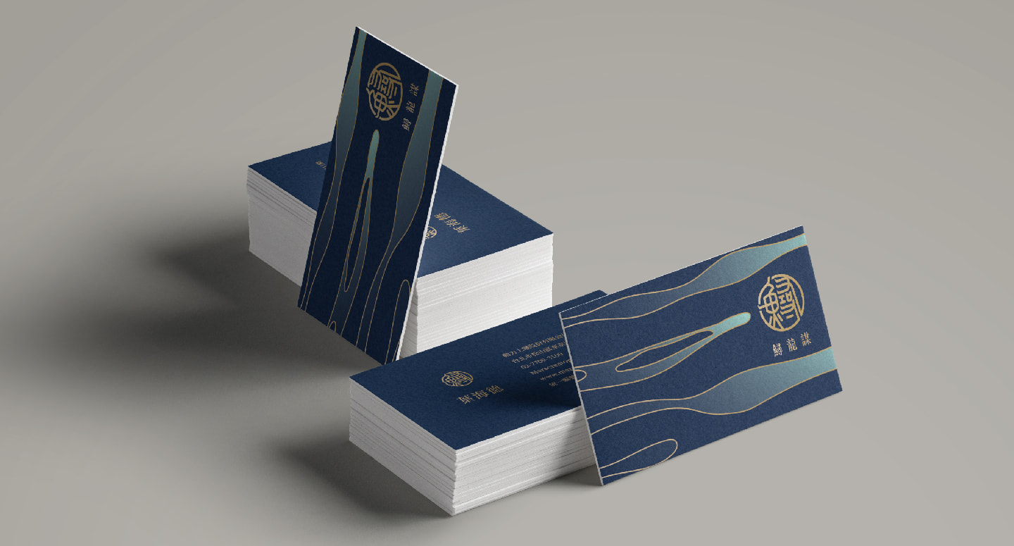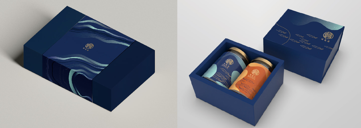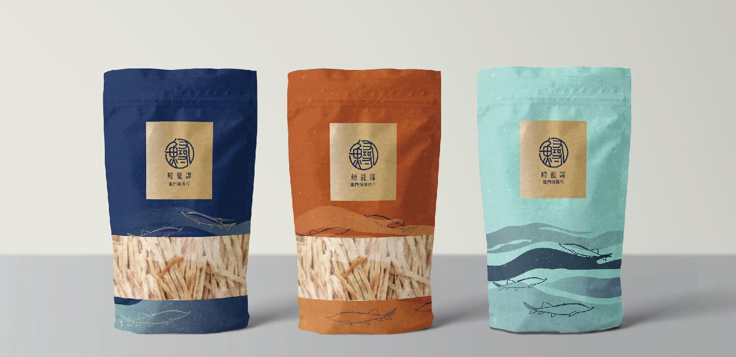
The brand design uses seal script as the main structure to convey the spirit of the brand's integration of ancient culture. The strokes cleverly incorporate the characteristics of the sturgeon's pointed mouth and dorsal fin, highlighting the brand's uniqueness. Gold represents authority and nobility, silver-white represents quality and purity, and blue represents cold water temperature, which is in line with the characteristics of the brand and its products. The overall design style is concise and lively, highlighting the brand's characteristics and improving visual effects, attracting consumers' attention.


