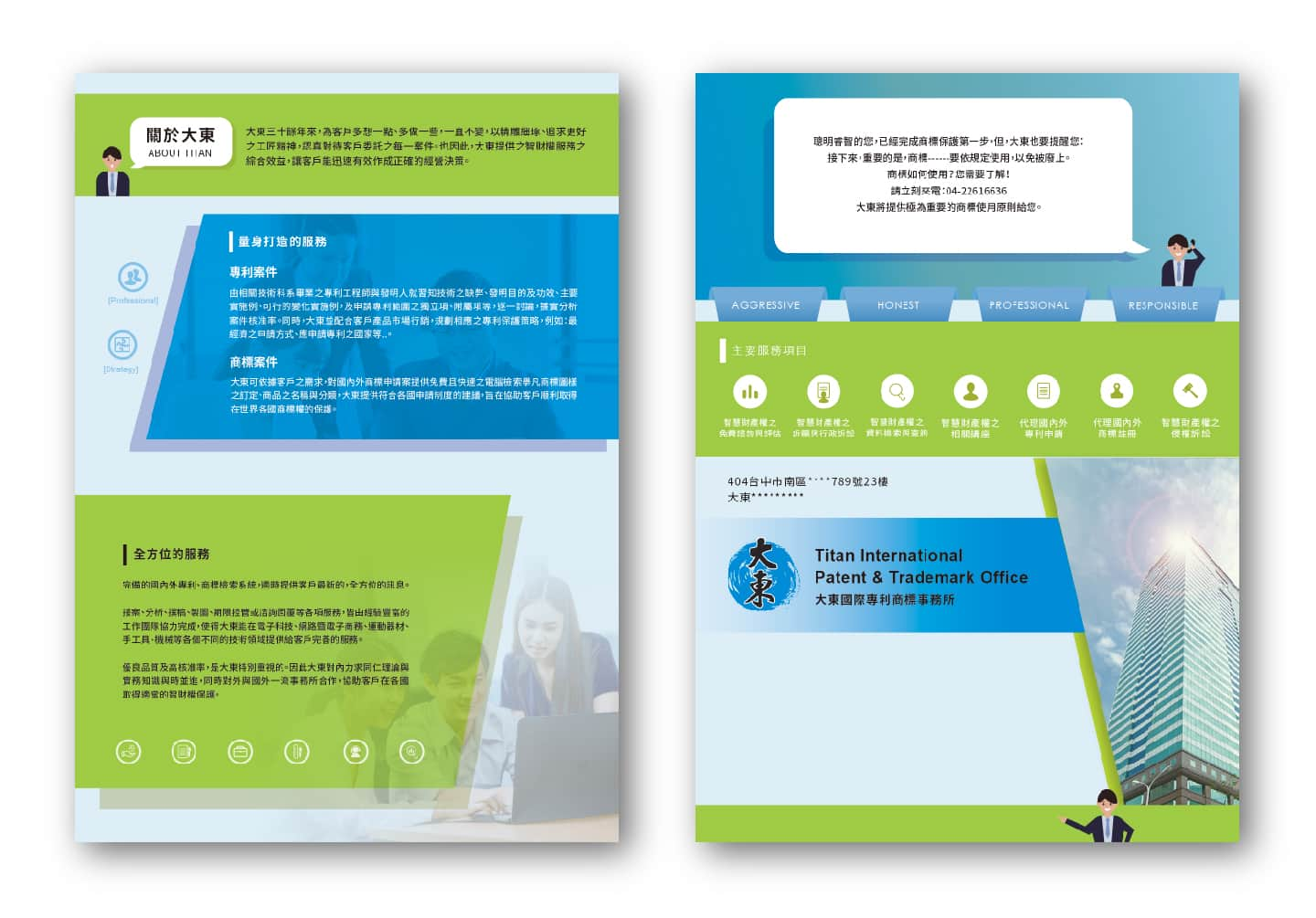
The design style features a protagonist in the form of a professional character, running through the entire design, giving consumers a sense of having someone explaining things to them, which can make the brand more approachable and trustworthy. The overall color scheme uses the company's standard blue color paired with blue-green, making the overall design bright and refreshing. At the same time, clever use of small details such as icon icons and patent drawings add to the image of the patent office, making the brand more professional and persuasive, and able to attract more consumer attention.