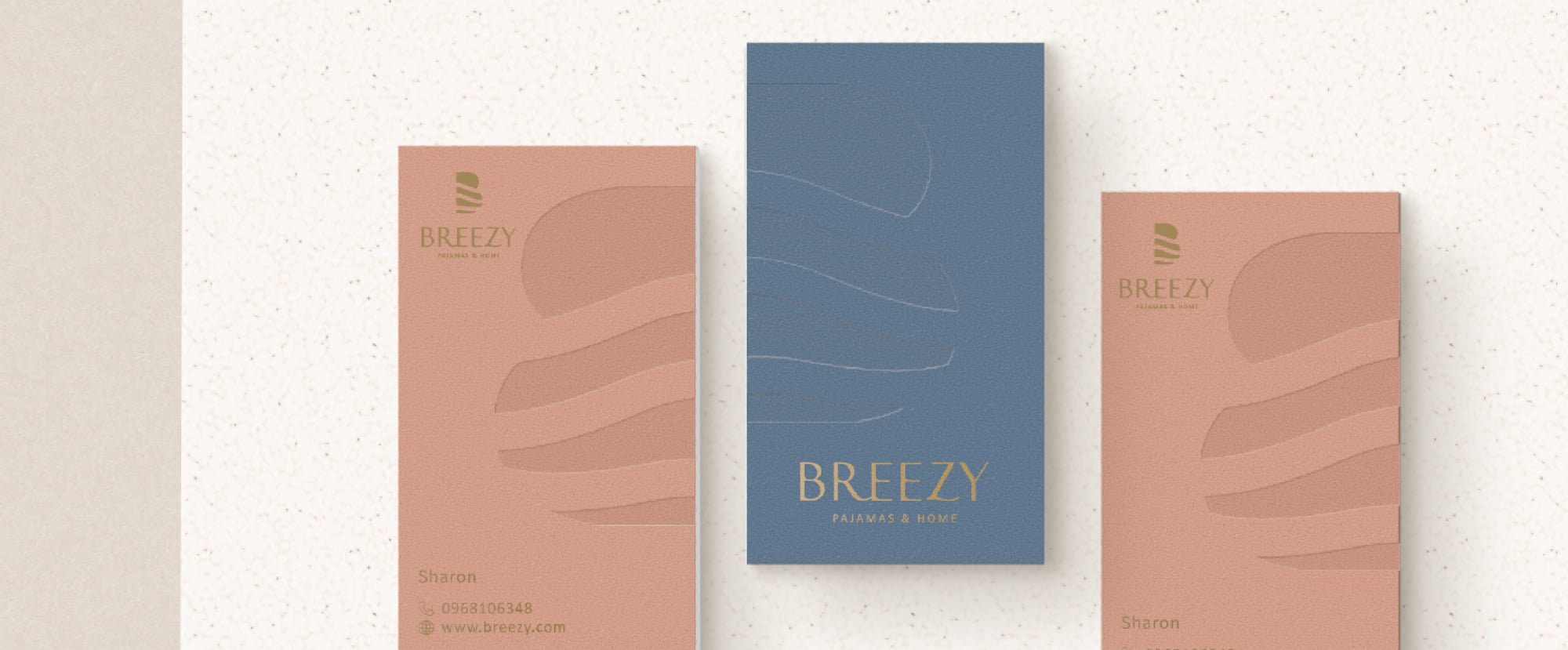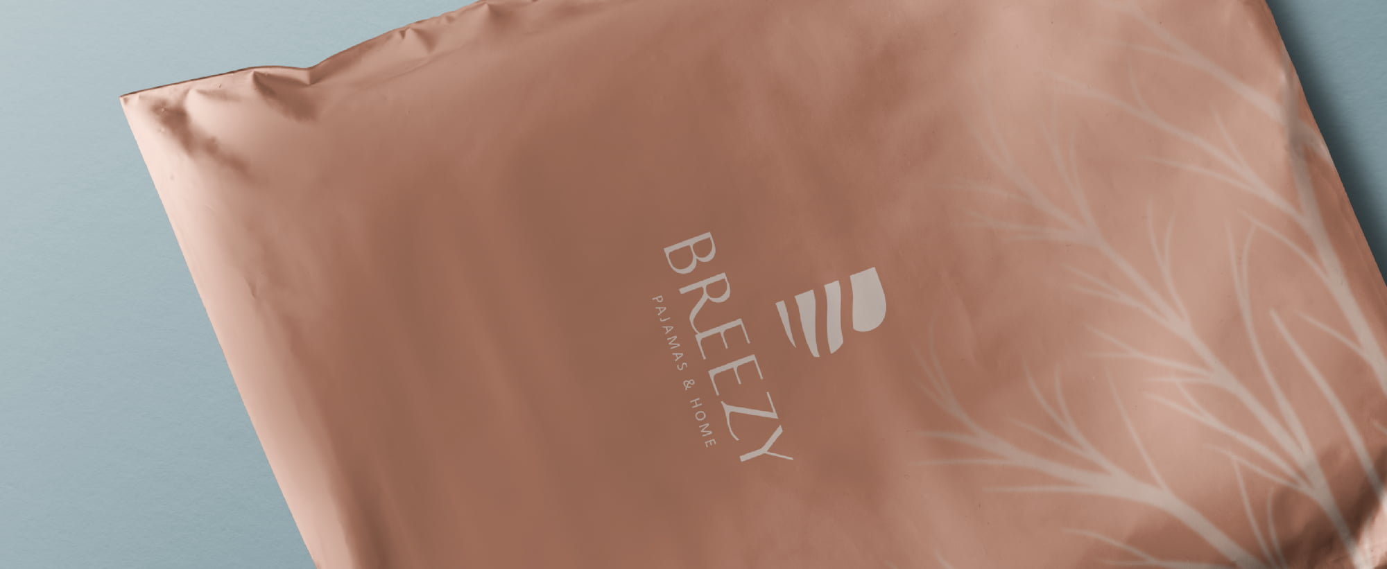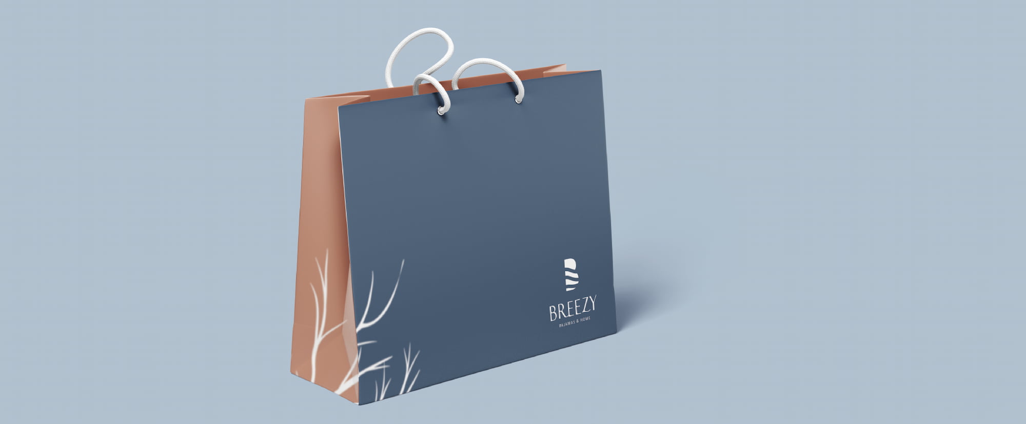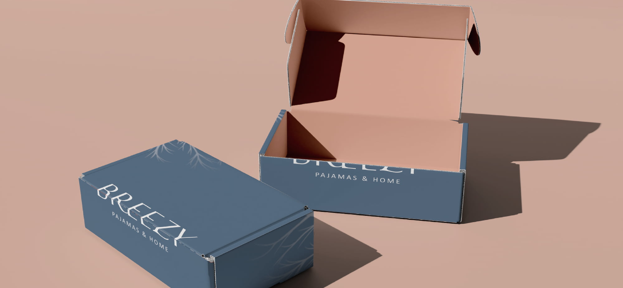


The dynamic movement of the letter B brings a comfortable feeling like a gentle breeze. To distinguish from other brands in the market, soft shades of pink-orange and misty blue are chosen for the color scheme, emphasizing the uniqueness of the brand.

The designer incorporated the image of wind blowing through treetops into the packaging as the main theme of the entire series, allowing consumers to feel the comfortable atmosphere created by the brand.
